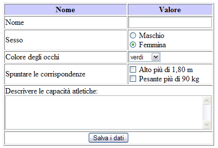
Forms sit at the center of many important digital tasks, including signing up, checking out, booking an appointment, requesting support, or applying for a service. Well-designed forms help people move forward without having to decode confusing language, correct avoidable mistakes, or wonder what will happen to their information. Reviewing real input fields UI patterns can also help teams notice how labels, spacing, helper text, and controls affect the experience.
The strongest forms are not necessarily the shortest. They ask only for information that supports the task, explain requests that may feel sensitive, and provide useful guidance when users need it. Treat every field as part of a conversation: the service asks a clear question, the user provides an answer, and the interface responds predictably.
Why Forms Still Matter
A form often appears at the moment a person is closest to completing a goal. That makes friction especially costly. A booking flow that asks for a full address before showing available times, for example, can make a simple task feel unnecessarily demanding. Poorly chosen questions, vague labels, and strict formatting rules create hesitation because users must stop and figure out what the system expects.
A form is more than a collection of controls. It is a sequence of decisions that affects whether people can complete a task accurately and comfortably. Each unnecessary question adds effort. Each unclear request creates doubt. Each useful instruction can prevent a support request or an abandoned submission.
Start With the User’s Goal
Define the Main Task
Start by naming the one outcome the form should support. A newsletter form needs an email address. A delivery form needs information required to fulfill an order. If a question does not help complete the current task, move it to a later time or remove it. Clearly distinguish required fields from optional ones, and avoid marking every question as mandatory simply because the information might be useful someday.
Match the Form to the Situation
Simple tasks usually deserve a simple form. More complex tasks, such as insurance claims or account applications, may be easier when divided into logical stages with a clear progress indicator. When requesting financial, identity, health, or other sensitive information, explain why it is needed before the person is asked to provide it.
Use Clear Labels and Helpful Instructions
Labels should stay visible after a person begins typing. Placeholder text alone is not a reliable substitute, as it can disappear once the field contains an answer. Use direct, familiar wording such as “Email address,” “Phone number,” or “Order number,” rather than broad labels like “Contact details” or “Reference.”
Place instructions close to the field they describe. If an account number must contain a certain number of digits, say so beside that field rather than in a general note at the top of the page. Examples can clarify formats, but they should not replace labels or be mistaken for required content.
Write Labels That Answer Basic Questions
Effective field language answers three practical questions: what information is needed, what format is expected, and why the answer matters when that context is not obvious. Helper text is valuable when it prevents a predictable mistake. It becomes clutter when it repeats what a clear label already says.
Choose the Right Field for Each Answer
Match the control to the required response type. Use a single-line field for short entries, a text area for explanations, and checkboxes or radio buttons when people choose from a short, known set of options. A searchable selection pattern can work better than a long dropdown when users may not know the exact available option.
- Use email, telephone, numeric, and date inputs that reflect the expected data.
- Allow people to enter information in familiar formats when possible.
- Use autocomplete attributes to support browser autofill and password managers.
- Translate internal terminology into language customers understand.
People should never need to understand database categories or back-office processes to complete a form. The interface should handle the translation, not the user.
Build Accessible Forms
Accessibility belongs in the first design and development pass. The relationship between labels, instructions, grouped controls, and validation matters because people may navigate with a keyboard, screen reader, voice input, magnification, or a combination of tools.
- Associate every input with a meaningful visible label.
- Make all controls and actions usable with a keyboard.
- Keep keyboard focus easy to see.
- Do not use color as the only signal for required fields or errors.
- Group related choices, such as delivery methods or contact preferences.
- Ensure error feedback is announced and discoverable for assistive technology users.
Check Reading and Focus Order
The order in which controls receive focus should follow the visual task sequence. If the layout looks logical but keyboard focus jumps across unrelated sections, the form becomes harder to understand and complete.
Make Errors Easy to Fix
Error handling should help people recover, not blame them. “Invalid entry” identifies a problem but gives no next step. “Enter a 10-digit phone number, including the area code” explains both the issue and the correction.
Show an error near the affected field, preserve answers already entered, and move focus to the first issue when that helps users resume the task. For forms with several problems, a summary near the top can help users understand what needs attention while field-level messages provide the details.
Design for Mobile and Small Screens
Mobile form design requires generous tap targets, a single-column layout when space is limited, and enough room for labels and errors to remain readable. Avoid placing several narrow fields in a single row unless the relationship is obvious and the controls remain easy to reach.
The practical form guidance for responsive interfaces also reinforces a useful principle: let people use device features that reduce effort. Support autofill, password managers, browser suggestions, and appropriate on-screen keyboards instead of forcing users through custom input behavior.
Reduce Friction Without Reducing Trust
Reducing friction does not mean hiding important details. Ask for only what the current step requires, reveal additional questions when they become relevant, and let users review important answers before final submission. Explain account creation, marketing consent, fees, and data use in plain language.
A disabled submit button can be frustrating when users cannot see what remains incomplete. If an action is unavailable, provide clear guidance about the missing information. Transparency builds confidence, especially when a form requests personal or sensitive data.
Test Under Real Conditions
Forms need testing beyond the ideal path. Review them with realistic devices, assistive technologies, and imperfect answers.
- Complete the form using only a keyboard.
- Zoom the page and confirm labels, fields, and messages stay usable.
- Test on a small phone and a large desktop screen.
- Try blank, incorrect, unusually long, and pasted responses.
- Check autofill, password manager, and screen reader behavior.
- Watch people unfamiliar with the product complete the task.
- Review analytics for repeated errors and incomplete submissions.
A Form Design Checklist
- Every field has a clear purpose.
- Labels are visible, specific, and easy to understand.
- Required and optional fields are clearly identified.
- Users can complete the form without a mouse.
- Error messages explain how to recover.
- The form works well on phones and supports autofill.
- Sensitive requests include useful context.
- Entered information remains available after validation errors.
Conclusion
Strong form design removes doubt at every step. Clear labels, suitable controls, accessible structure, useful validation, mobile-friendly behavior, and transparent requests make tasks easier for more people. The best forms do not merely collect data. They guide people toward a successful outcome with fewer surprises and more confidence.